The Anubis Gates
by Tim Powers
Client: Centipede Press
Scope: packaging, interior design and gatefold illustrations
Published: 2013
Synopsis:
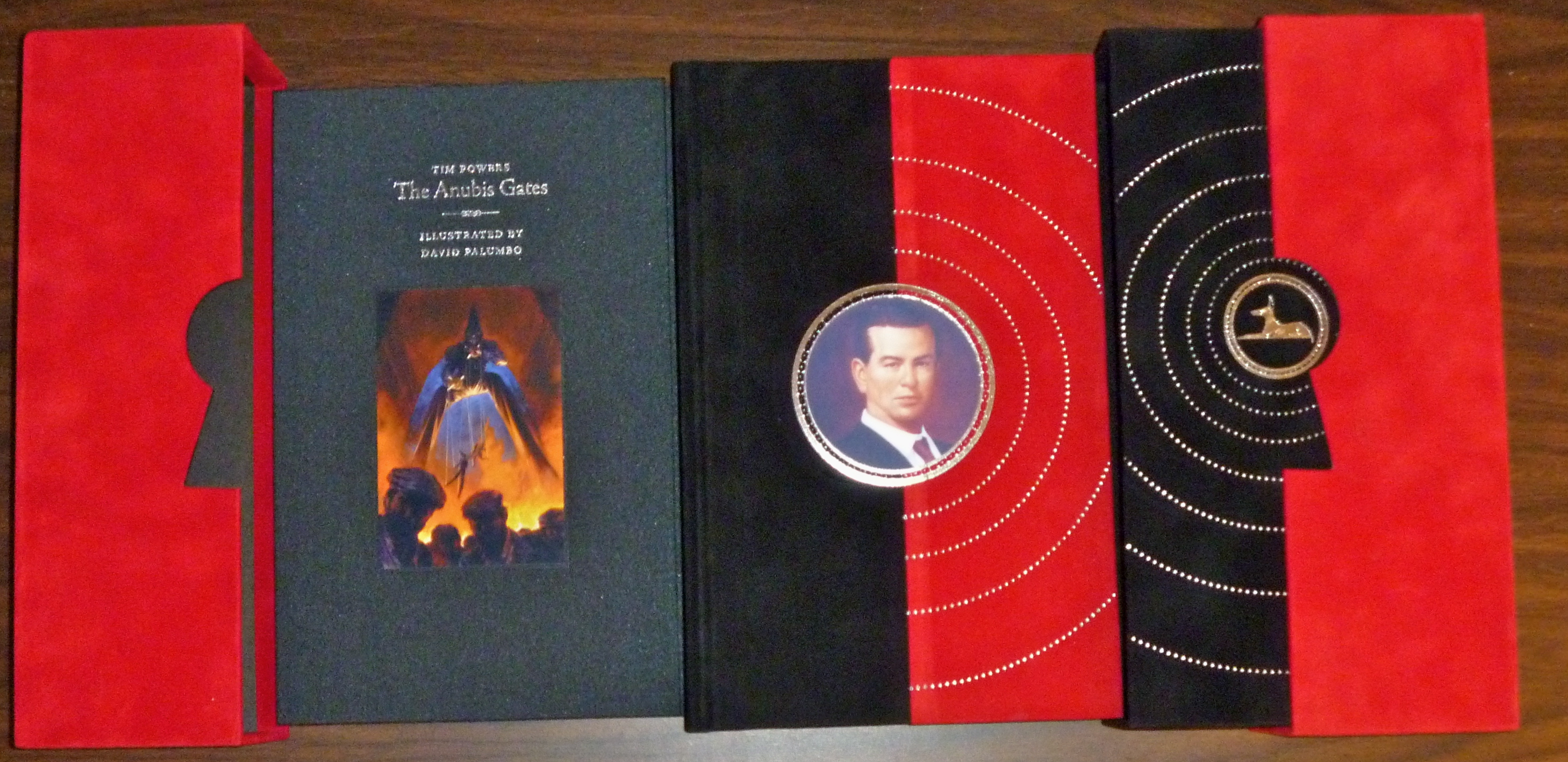
Tim Power’ classic time travel novel, The Anubis Gates, is a huge favorite of mine, and when Centipede Press asked me if I’d be interested in designing a deluxe slipcased edition, I jumped at the chance.
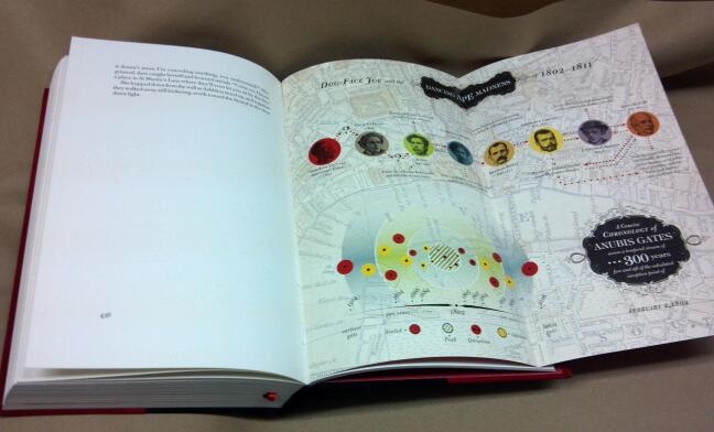
When I joined the project, artist David Palumbo had already painted several breathtaking and evocative paintings depicting different plot points in the book. I didn’t want to visually compete with his beautiful scenes, so I thought about pulling back the design as far as possible, to basic elements.
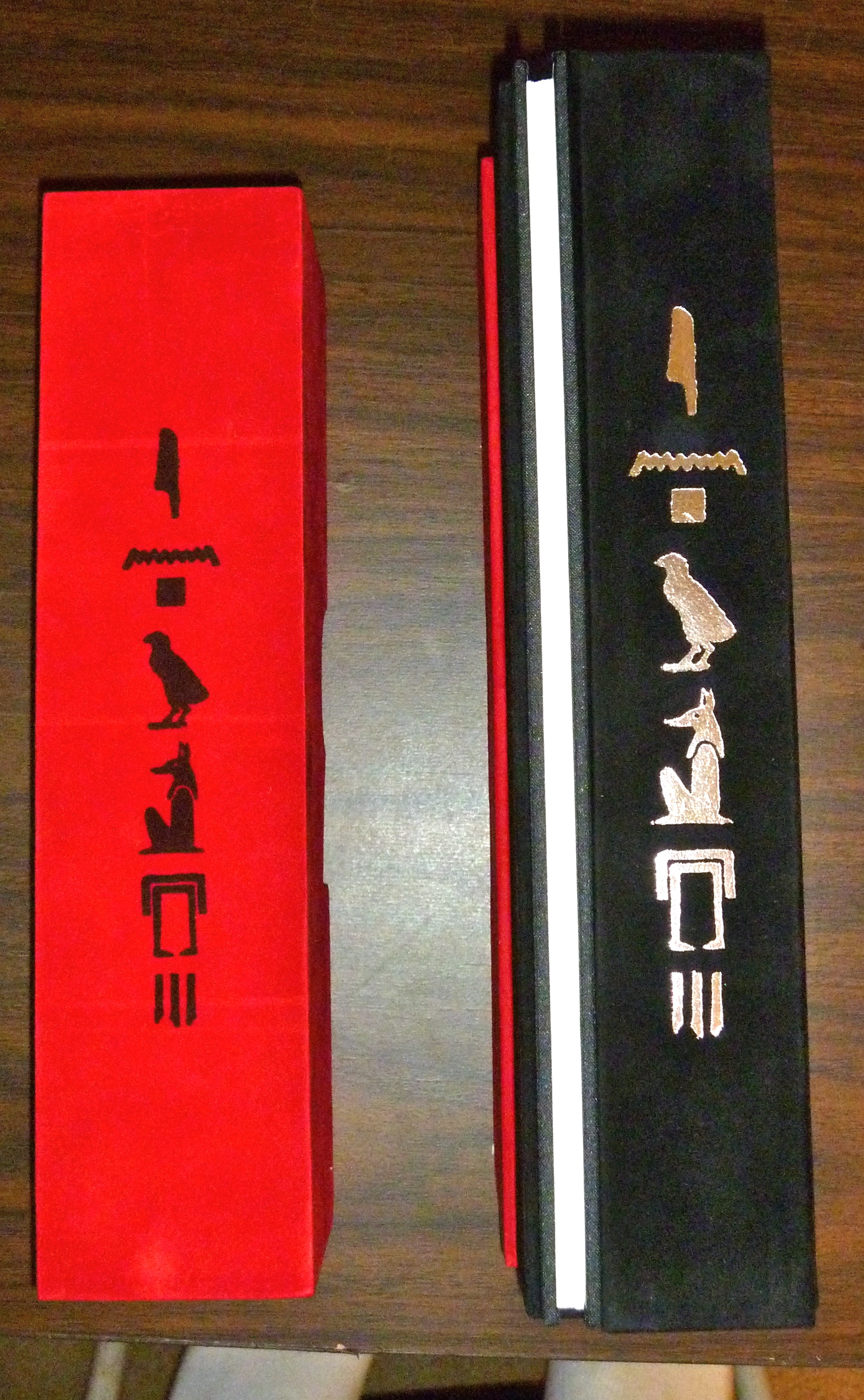
For the case and book covers, I liked the idea of trying to marry this very iconographic Egyptian art style (with the Anubis and the hieroglyphs) to a super-restrained geometric design in black, red, and silver. The title hieroglyphs say as close to “Anubis Gates” as my Google scholarly skills could muster. The keyhole die cut in the middle of the matching case halves references the unlocking of the gates.
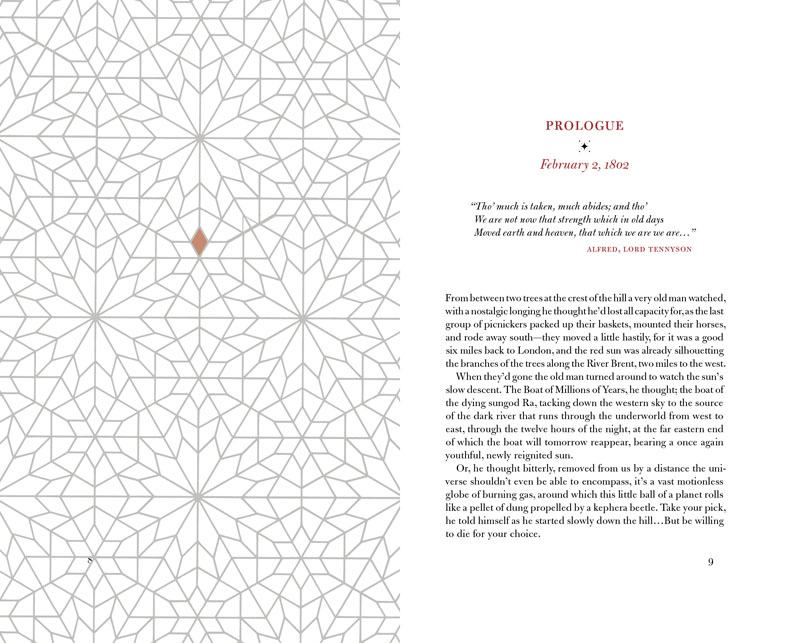
I took a similar tack with the interior design. I had the luxury of having full color on the inside as well, so I used red as a liberal accent color and an islamic-inspired geometric design for the facing pages of each chapter beginning.
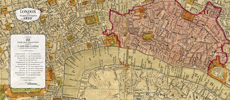
The most time-consuming part of the book design were the tipped-in gatefolds. I came up with two concepts: a double-gatefold map of 1810 London that detailed all the major plot locations in the book, and a single-gatefold infographic explaining the body-swapping and temporal gates that occur in the book. It took less time to design them than to scour every page of the book to find the datapoints I needed to visualize. That and trying to locate places on the 1810 map using modern day Google Maps to help me pinpoint – a fun challenge.